
Through the Eyes of True Love
SELECTED GRAPHIC DESIGN WORKS


PROJECT I: Branding, Print, Event, App, Packaging
This is How
-
Course: Visual Thinking
Instructor: Sandra Isla
Project: This is How
Semester: Fall 2021
Categories: Branding, Packaging, Print, Event, App
Keywords: Accessible, practical, trustworthy
-
The objective of this project was to create a human-centered brand and visual system that would be applied across three related deliverables.
-
This Is How is a brand dedicated to making home repair skills and tools available to ordinary homeowners. The objective is to increase access to the skills and tools needed to complete basic home maintenance and respond to small household emergencies. The goal of the brand is to help homeowners learn how to perform common maintenance and repair tasks.
The brand and visual system has been applied across three deliverables that focus on increasing homeowners access to skills and tools. The free skills workshop encourages people to drop in and learn how to make basic repairs and handle minor home emergencies. The app makes a range of DIY knowledge available to anyone. Each skills video is accompanied by a visual and textual explanation. The vending machines free people from home improvement shopping during business hours and allow them to purchase the tools they need at any time.
PROJECT II: Print
“Beware the Jabberwock”
-
Course: Type Systems
Instructor: Hunter Wimmer
Project: “Beware the Jabberwock”
Semester: Spring 2021
Categories: Print
Keywords: Viral, programmed
-
The objective of this project was to design a chapbook using the transcript of a podcast.
-
“Beware the Jabberwock” is an episode of the This American Life podcast. Throughout the episode, Ira Glass relays the story of how a conspiracy theory affects real lives, followed by the origin story of the loudest conspiracy theorist of our time: Alex Jones.
The visual system was inspired by computer programming language, using HTML tags to identify the speaker throughout the podcast transcript. The images were styled to appear as monochrome in a deep maroon color.

PROJECT III: Print
Insectarium
-
Course: Type Composition
Instructor: Lian Ng
Project: Insectarium
Semester: Fall 2020
Categories: Print
Keywords: Playful, structured
-
The objective of this project was to format a coffee table-style photography book with accompanying text.
-
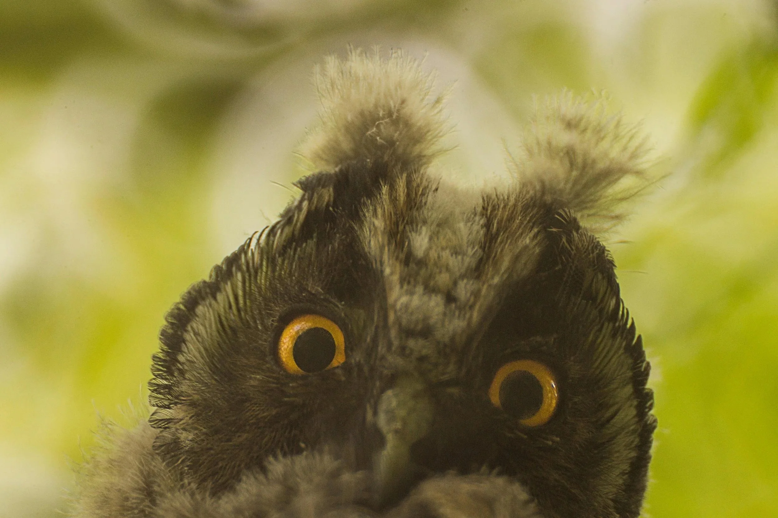
Insectarium uses the text from An Elementary Study of Insects by Leonard Haseman. The dense academic text was transformed by being paired with striking insect photographs. The images of the insects are extreme close-ups, making them appear larger than life. The vibrant color palette was derived from the insect imagery and used to visually differentiate each section of the book.
PROJECT IV: Series, Motion Graphics
To the Bone
-
Course: Type Experiments
Instructor: David Hake
Project: To the Bone
Semester: Spring 2022
Categories: Series, Motion Graphics
Keywords: Solemn, fading
-
The objective of this project was to use experimental type through personal explorations to reimagine the posters and trailer of an existing movie.
-
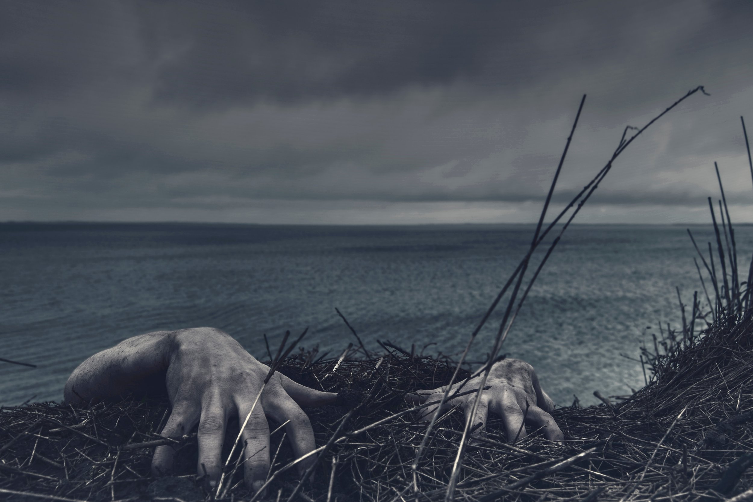
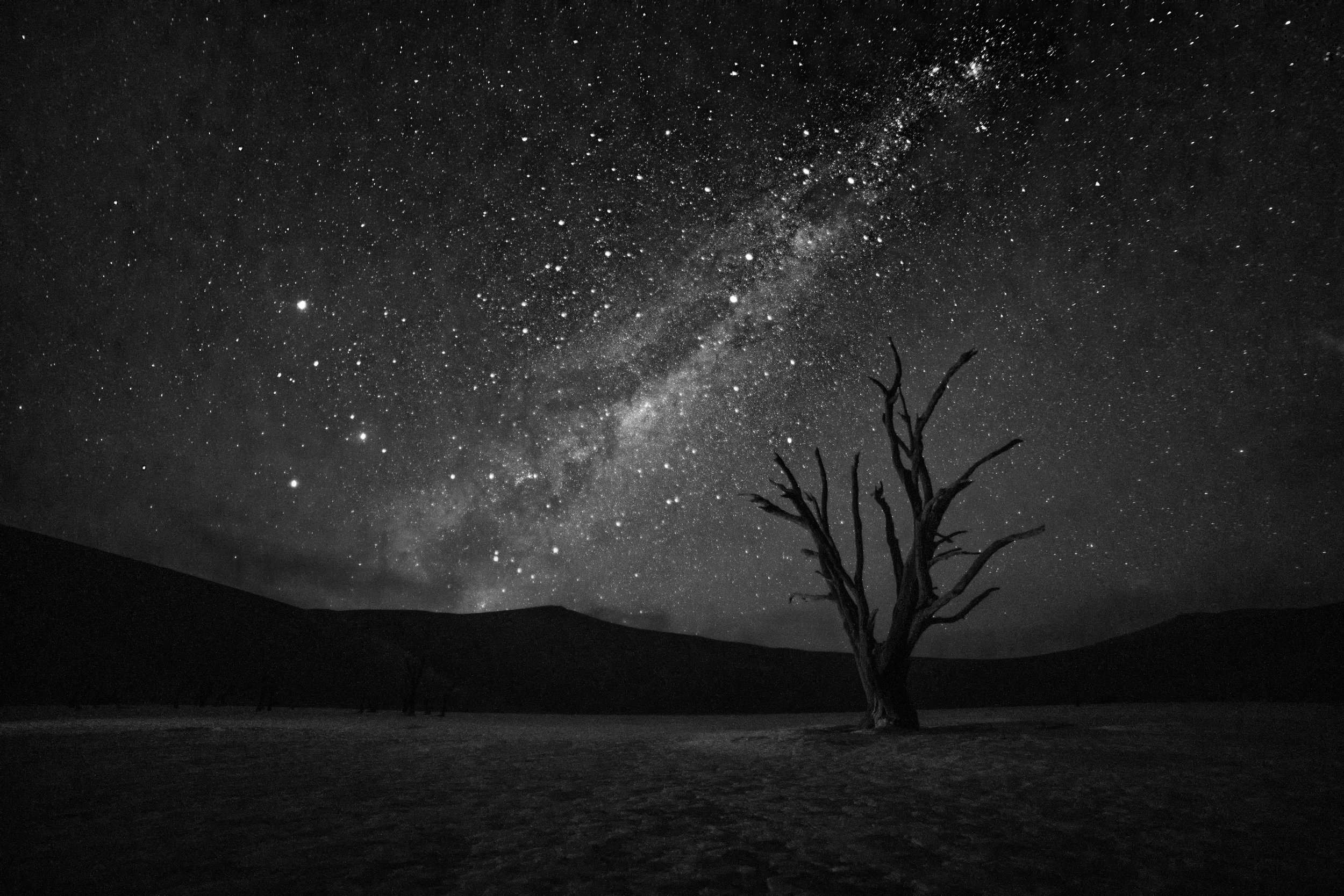
During my personal explorations, I was drawn to the effect of pulling color from permanent markers by running alcohol through the letters. Using this lens, I chose to reimagine the movie To the Bone. The movie follows a young adult, Ellen, as she struggles to find recovery in a group home for people with eating disorders. Throughout the movie, there is a sense of Ellen's persona slowly fading away.
The final type for the movie title embraced the fading away of Ellen and the fading letters of my explorations, resulting in a title that gradually thinned in stroke weight. The imagery created a clear, solemn focal point with a single subject on a black background. The objects included a strong and slightly intimidating fork, a dying flower reaching for the sunlight, and a young lady’s back with a sharp, protruding spine. The movie trailer applied the same experimental type style to selected phrases from the movie and paired them with similarly solemn images until the transformative ending. The music chosen for the trailer is slow but lends the slightest sense of hope.
PROJECT V: Event, Print, App
Revitalize the Mural District
-
Course: Type Systems
Instructor: Hunter Wimmer
Project: Revitalize the Mural District
Semester: Spring 2021
Categories: Print, Event, App
Keywords: Urban, larger-than-life
-
The objective of this project was to transform a local art gallery by creating new environmental designs, as well as a gallery guide and app.
-
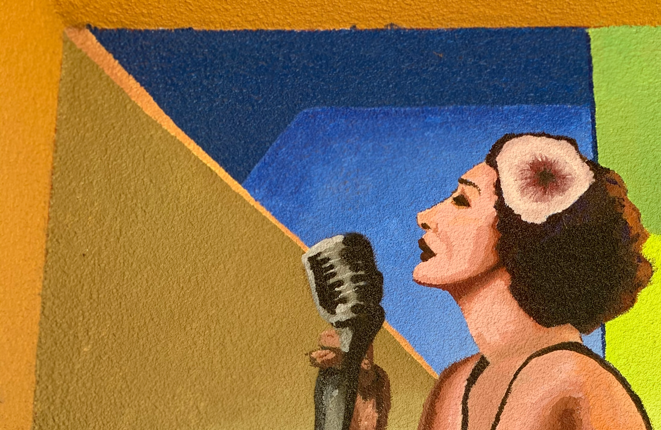
Fresno, CA is home to a lively arts district that is adorned with large murals on nearly every building. Despite the prominence and popularity of these murals in the city (with one mural often appearing in advertisements for the city), there has never been any formal print or digital collection of the various murals, their artists, and their locations.
Revitalize the Mural District was envisioned as a nonprofit that worked to bring life to the district. An oversized booklet directed patrons around the area and provided information about each piece. Due to the substantial number of murals available, a specific artist was chosen to be featured at the event. The environmental designs were also intended to be oversized, with hanging banners that spanned the streets and directed people to even some of the most hidden murals. The app supplied much of the same information as the gallery guide, but also featured Augmented Reality capabilities that allowed patrons to take photographs of themselves enveloped within the artwork.
PROJECT VI: Packaging, Print
Caution: Madness Within
-
Course: Type Experiments
Instructor: David Hake
Project: Caution: Madness Within
Semester: Spring 2022
Categories: Packaging, Print
Keywords: Spicy, colorful, madness
-
The objective of this project was to find a poem in a foreign language and then use the glyphs and characters from that poem to create new words, designs, and patterns.
-
The poem chosen for this project, “Granny,” by Koyamparambath Satchidanandan is written in Malayalam, one of the many languages spoken in India. The poem reads:
My granny was insane.
As her madness ripened into death,
my uncle, a miser,
kept her in our storeroom
wrapped in straw.
My granny dried up, burst;
her seeds flew out of the window.
The sun came, and the rain;
one seedling grew up into a tree,
whose lusts bore me.
Can I help writing poems
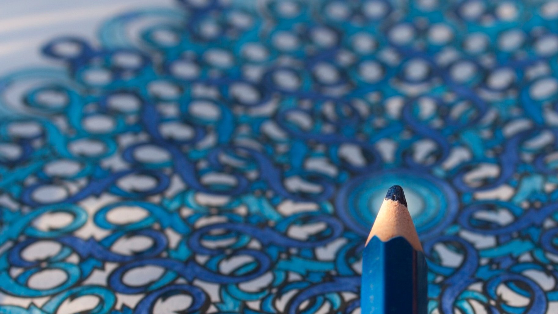
about monkeys with teeth of gold?Upon first glance, the letterforms of the Malayalam language conjured images of fluid lines and intricate swirling patterns. There was a sense of doodling in a notebook and daydreaming. It is a beautiful written language system. After reading the English translation of the poem and discovering its dark, morbid nature, I thought there was such an interesting juxtaposition of form and content: the beautiful, delicate letterforms conveying the dark, twisted meaning. Immediately, I thought of irreverent adult coloring books that display cuss words in elegant scripts. The Malayalam characters were broken down into the shapes and pieces that form the glyphs. Those pieces were then used to construct a series of six mandalas. Next, the mandalas were paired with single line drawings to create coloring book pages. Finally, the book was expanded into a full art box including colored pencils, paints, and souvenir pins. The word “Madness” in the art box title was also created using Malayalam characters.
PROJECT VII: Branding, Print, Website
The Learning Company
-
Course: The Nature of Identity
Instructor: Hunter Wimmer
Project: The Learning Company
Semester: Fall 2022
Categories: Branding, Print Website
Keywords: Spicy, colorful, madness
-
The objective of this project was to revive an old brand with a new take on branding, meant to reach the audience on an emotional level.
-
The Learning Company was once a thriving resource for classrooms with educational content meant to expand the minds of students and adults alike. Today, the brand lives as TLC—a channel primarily known for a wide variety of reality television shows.
This project sought to bring The Learning Company back to its educational roots, but with a modern twist. The new brand focuses on the ideas of Exploration, Connection, and Creation.
PROJECT VIII: Print
Portfolio
-
Course: Portfolio
Instructor: Mary Scott
Project: Caution: Madness Within
Semester: Fall 2022
Categories: Print
Keywords: Personal, warm
-
-